The Silver Rings is nearing publication, the text and the interior of the book is being finalised, discussions are underway with printers about costs and possible covers are being considered. Dull, but absolutely necessary, I have been proof-reading what I hope will be the penultimate printed version, excising the niggling little problems, the unwanted blank spaces or rogue capital letters, which can creep into a text. Preparing the ‘e’ book is another matter, on-line retailers don’t all have  the same requirements, and meeting those requirements is just as necessary as eliminating the errors, because if they are not met, the resulting book will look horrible on-line.
I have also been inserting a map. Not the map of the walled city of Jerez found in Reconquista, though that is also there in the sequel, but an additional map of Al Andalus, showing the Sierras to the east of the city. This was a relatively common request from readers of the first book which I have tried to satisfy in the second.
One piece of work I have enjoyed doing is discussing possible covers with graphic designer and near neighbour Dan Mogford ( and being distracted by very jolly, hyper-active new puppy Ralph ). Dan is mainly freelance, but also works  for Harvill Secker, Penguin’s crime imprint. In addition he specialises in non-fiction covers – so, for example, he was responsible for the cover of Jay Rayner’s recent opus (left).
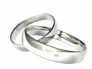
He has tried to reference the first cover, that of Reconquista, while creating a new one, by continuing with the idea of a single central image. On the cover of Reconquista this was the antique sword, which formed a cross with the title. In this case there are three interlocking rings. One version had title, tag-line – ‘Friendship Forever’ – author’s name and the central image horizontal on the page, a very classic book cover. The background was an intricate Arab mosaic. It was not, however, the one I asked him to work further on.
That version was more dynamic, with three inter-linking silver rings cascading down the cover, woven in and out of the title. These rings weren’t as glossy or finished as the rings on the other cover, much more like rings which the three friends at the heart of the book would have made. We are, at the moment, considering just how much emphasis to place on the symbols which are etched into the rings and what colour the background might be. This is plain, not mosaic, because of the complexity of the  cascading rings image, but with tonal changes at the edge. It will not be the same deep red as Reconquista, but will be similarly rich. The whole thing will, we hope, be eye-catching, at thumbnail size as well as book size, because it has to attract readers in on-line stores as well as book shops. You can see early drafts in this TheSilverRings pdf, if you are interested. Let me know which one you prefer.
Then, of course, there is the launch campaign. Not a physical launch party this time – I am insufficiently mobile following surgery for that ( see Sunshine and Flamenco Guitar for the launch of Reconquista ) but quite a lot will be happening on-line. That’s for another post….
If you want to read more about preparing a book for publication try From Gutenberg to Google Galleys & Ornaments When is a font not a font? What’s In a Name?


 RSS – Posts
4 responses to “Final Touches to The Silver Rings”