
This week I have been working hard to prepare the 2015 Story Bazaar Compendium for publication, designing and formatting the interior of the book and 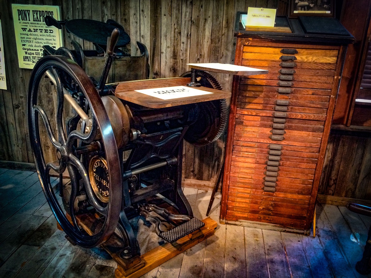 working with the cover designer. This is the painstaking, technical part of publishing. It is, of course, much easier today than formerly, with software to help with the interior design. I use a number of design templates as well as doing my own formatting. It is certainly no longer such a physical challenge as with manual moveable type ( the origin of which was in China, but which was developed in Europe by Johannes Gutenberg and his eponymous printing press). I also had a long conversation recently with a gentleman who used to work ‘in the print’, in his case, newspapers, during the days of hot metal.
He described to me how it was, labouring in the ‘print shop’, amid the constant noise and heat of the giant printing machines. His job was to go through the printed sheets to ‘page set’, checking the lay-out and the type-setting and changing it if it was incorrect or looked bad. He had no special printing qualifications, having started work in printing straight after National Service, and no design background, but was responsible for many years for the lay-out of one of Britain’s national daily newspapers ( and the ‘Father of the Chapel’ ). He mourned the passing of the camaraderie of the print shop, but didn’t mourn the, sometimes very hard, labour.
The production of books has, as we know, seen technological revolutions before, yet what is remarkable is how much has stayed the same. And how  similar the issues I face are to those faced by printers of the earliest Oriental woodcuts or the type-setting and page-setting of my ‘hot metal’ man. We don’t have solid matrices any more, we have software generated ones, but the filling of those matrices, with wooden blocks or other reliefs, with metal plates incised by burins, with inked plains or with format code and text, is still what it’s all about.
So you start with the basics, what size will the book be? What is it’s ‘trim’? A book can be any size, but there are certain things to bear in mind. Trade paperbacks are most common (aside from the real mass market 4″ by 7″ books). Text-based books are usually in the proportion of 2:3, while art books tend more towards square. Print on demand technology restricts you to between 5″ X 8″ and 8.5″ X 11″ and some POD printers restrict you even further. Createspace, the Amazon self-publishing arm, offers only three sizes with non-white paper and, even with white paper, they encourage users towards the 6″ X 9″ size, through pricing. As it happens, this was the size I chose for ‘The Village’ anyway and will probably do the same for the Compendium. It meets the ‘golden canon of design’ tests for good book design ( as formulated by Jan Tschishold in ‘The Form of the Book’, my book interior bible, which is still winning plaudits today, see Eye ). By the way, most book shop shelves will take only books no bigger than 7″ X 10″.
So you have the trim. Now, how will you paginate? (And this means more than putting page numbers on the bottom of pages.) Here we find the ongoing  debate about what to do with ‘widows and orphans’. When you get to the bottom of a page, there might only be room for one more line. If that line is the start of a paragraph it will be indented and look a little lonely. Also, all but the last line of a paragraph may fit on a page, but the next page will then hold the last few words of the last sentence in the paragraph. So you might have, say, only three words in that first line. These lonely words and those lingering at the bottom of a page are known as ‘widows and orphans’.
It’s easy to paginate out these lonely words, but, if you do, your page lay-out will be disturbed. Text is squared-off, into the print space or Salzspiegel, so there are the same number of lines on each page, but if you start eliminating the widows and orphans you are tampering with the number of lines and creating a greater space at the bottom of the page (or at the top of the next page). Okay, this was a problem in the old days, you say, but can’t software adjust the spacing to take account of this? Yes, it can, but then you get stretched lines, large spaces between letters, which stand out like a sore thumb and look, in my humble opinion, much worse than the widows and orphans did in the first place. More sophisticated software also adjusts for this stretching, but, somewhere along the line, there is a knock-on effect.
Is designing the interior of a non-fiction book different to designing the interior of a novel or collection of short stories? Well, yes it is. There are lots of  new things to consider, like illustrations, printer’s ornamentation, page organisation and indexes. And the front and back matter will be different too. I will return to this in a later blog.
Finally, before you ask – which is a widow and which an orphan – I will say that there is not agreement. The Chicago Manual of Style says that an orphan is at the bottom and a widow at the top of a page, but some folk believe the opposite. When I asked my ‘hot metal’ man about widows and orphans and how he dealt with them, he said that he just changed the text to fit! I wonder how many journalists have read their own copy wearing a puzzled frown because they don’t recognise some of it.
If you enjoyed reading this article you might also like How NOT to write How NOT to write again

 RSS – Posts