
It’s time to give serious practical thought to exactly what ‘Reconquista’, both the book and the web-site, will look like. Thus far, I have been using a cover designed by the lady who won the book cover competition which I ran last year. I like this cover, with the Moorish arches (from the Alhambra) and the glittering water 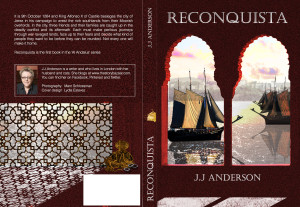 image on the rear cover, but, I realise, after having researched the Young Adult book market further, that just because I like it, doesn’t make it a good YA book cover.
Why didn’t I think of this before, you may ask and it’s a good question. The answer is because I didn’t really think about my readership at the outset. To be fair to myself, I did initially – I wrote the book for my god-son and nephew – but the latest version is a different book altogether and for different readers. I should have considered this earlier. See ‘How NOT to write’ for similar errors. The origin of this book has caught me out in a lot of ways.
A good YA book cover has to draw the reader in immediately, even more so than a good adult book cover. Teenagers give even less time to contemplating a cover than do adults (three seconds maximum is what the marketing data people say). So it has to grab the attention and stimulate interest immediately. A good YA book cover, especially when a book isn’t part of a series, has to shout ‘This is exciting! Read me!’. My existing cover is attractive and sets the scene for the book (the Moorish arches, the ships, the castle beyond) but it is a static image, even though the ships beyond the arches are, presumably, moving, there is no sense of excitement.
One way to import that excitement is with words. My existing rear cover ‘blurb’ is descriptive, but it doesn’t really whet the potential reader’s appetite. It 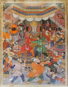 needs to set the scene, yes, but more importantly it must tell the reader why s/he should buy and read the book – because it’s mysterious, engaging, exciting, exotic and enthralling. Because it’s about young people just like the reader. So I re-wrote this. The original blurb is set out below.
‘It is 1264 and war wages across Al Andalus as the Christian lords from the north try to wrest the southlands from their Moorish overlords. In Jerez de la Frontera three friends and their families are caught up in the conflict as the city is besieged by the army of King Alfonso X of Castile. One is buried as the castle is bombarded, one escapes to the countryside, where bandits roam and the other waits in the city, for news, while his cousin sets out on a perilous journey of her own. Through war ravaged lands, the friends meet war lords, kings and pirates in their quest to be re-united once again in their home city. On the Frontier is the first in the Al Andalus series of novels by J.J.Anderson’
‘It is 9th October 1264. Outside the city an army awaits the signal to attack.
Within the city walls, fourteen year old Nathan, his older cousin, Rebecca and their friend, Atta, face an uncertain future. On this fateful day, the city they have always known is about to be torn apart. Friends and family are about to be scattered far and wide. The places they have always known will be changed out of all recognition.
Each of them has a fateful decision to make.
Each has a journey to undertake.
In war-torn Al Andalus King and Emir vie for supremacy. Bandits and pirates roam land and sea in their wake, as our heroes set out on their desperate journeys to find freedom and safety. If they are to succeed, they must first face down their fears and decide what sort of people they want to be. All of them have to grow up.
Not all of them will make it home.
*
Book 1 in the Al Andalus series’
A bit more enthralling I think. And it tells potential readers more about the book’s protagonists too – both in terms of gender and age. This is important because its intended audience is of both genders, this isn’t a ‘boy’s book’ or a ‘girl’s book’.
I have also been working with Andrew from Design for Writers, to develop a new cover (and images which can be used on the web-site). I’ll be blogging about what makes a good YA cover, the covers we are discussing and the images used by others, as well as the proposed new covers for ‘Reconquista‘, in the near future. But one thing Andrew has already done is to pick out a ‘tag-line’ from my new blurb to feature on the front cover as a ‘hook’ for the reader. In this case he chose – ‘Not all of them will make it home.’ For a generation of teenagers who grew up with ‘The Hunger Games’, I think it works, but it’s a far cry from the books of my youth.
If you enjoyed reading this article you may also like How NOT to write again… Entitlement
Incidentally, the image above and to the left is from a 19th century Arabic book of The Arabian Nights and represents Sindbad.

 RSS – Posts
Pingback: Learn more about reconquista.online | reconquista.online