 When it’s a typeface (more of which later).
The Compendium will be the first non-fiction Story Bazaar book, but it’s as well that I am learning the intricacies of non-fiction formatting and software usage, as there are more non-fiction books planned for 2016. The first editions of these non-fiction books will be trade paperbacks, but we may also produce glossier, more expensive, versions as well. Either way, the learning, for me, has begun.
And it starts with typography. When I produced ‘The Village’ I used a typeface already known to me (Times New Roman) and set it at a standard usage (in terms of spacing and print lay-out). I used The Form of The Book as a guide, together with course notes. Incidentally, Jan Tschichold’s book is brilliant, though expensive, folk who are really interested in the subject but might not want to part with quite so much cash could try The Elements of Typographic Style by Robert Bringhurst, it’s more general and much cheaper. ‘The Village’ had chapter headings and headers and footers, but my short stories had no need of internal headings, sub-headings and sub-sub-headings. There was no need to decide on how to treat regular quotations, or separate out text, import pictures and caption them, create an index or a bibliography. I now have to decide on all these things with a non-fiction book.
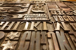
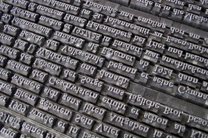
We are used to lots of choice when it comes to typography today. The earliest moveable-type printers used gothic blackletter, to mirror the scribed books then in circulation around them in Germany. Indeed Gutenberg’s first typeface was designed by a scribe, then engraved by a goldsmith. The Roman  typefaces, copying the letterforms used in Classical Rome, weren’t developed until the printing press spread to Italy where a typeface akin to that of the inscriptions on ancient Roman monuments was preferred. mainly because this adhered to the principles of Euclidean geometry. The most oft-quoted example is on the base of Trajan’s Column in Rome (or South Kensington). The Baroque and later periods saw a veritable explosion of typefaces, often named for their originators, like Monsieur Garamond.
But must a type face be different for non-fiction? No, there aren’t rigid rules like that. The principles of typography are based on legibility and readability (not the same thing, though linked). Legibility refers to the extent to which characters are distinguishable from each other. In practice, there are known problems with some typefaces, like the confusing of an ‘h’ with a ‘b’, or a ‘3’ with an ‘8’ so you would want to avoid these if your text contained a lot of numbers. Readability refers to the text as a whole. This is largely managed through organisation, spacing, structure etc., though sans-seriffed  fonts are considered to have low readability, so you would want to avoid these for long, uninterrupted passages of text, like novels. Type-face with serifs – the added strokes at the end of the strokes which form a letter, are considered easier to read than typefaces without serifs, or sans serifs. Fonts can have both serif and sans-serif variations. By the way, this article is written in a sans-serif script.
A lot of research has been done into how people read, the physiognomy of the eye and the ‘best’ and ‘worst’ typefaces. There are, perhaps appropriately, a legion of books written about typography, from Marshall McLuhan to the Royal College of Art. The unit there on the Readability of Print found that we ‘absorb’ groups of words ( up to three/four ) when we read, not individual words, and the eye can only cope with three or four of these groupings per line. More than that and the eye is strained. So compressed typefaces are less readable.
Now, back to the original question – typeface is the correct term for a style of lettering, not ‘font’. Historically ‘fonts’, originally, ‘founts’ in English, defined size and weight ( thickness or blackness ) of letter forms within a wider typeface or font family. So ‘Times’ is a font family and it has a consistent typeface, but Times Roman, Times New Roman, Times Bold are fonts. Some font families, like Helvetica, include many, many fonts, but all of them share the overall style or typeface.
Why do people confuse them? In part because this is the esoteric end of typography, in part because, when the first Apple word processors were introduced the top left of the screen showed a group of letterform styles, including typefaces and fonts and sizes, all together, lumped under the heading ‘font’. Go and look at your Microsoft Word program – it’s still there!
If you enjoyed reading this article you might also enjoy From Gutenberg to Google


 RSS – Posts